Pauline Knittel Céramique
User Research, Competitive Analysis, Brand Development, Wireframes/Prototyping
PKC
This case study illustrates my strategic approach to enhancing user experience, from intuitive design elements to robust shipping solutions, all aimed at instilling confidence in customers and facilitating seamless online transactions. Learn about the strategies and innovations that transformed apprehension into excitement, as my team and I guided our client to expand their reach and thrive in the digital marketplace.
Project Duration: 2.5 weeks
Overview
In the realm of UX/UI design, our team of three designers embarked on a fascinating journey to create a responsive e-commerce website for Pauline Knittel Céramique, a small business based in Bordeaux, France. The focus was on enhancing the user experience for ceramic lovers who sought a reliable and trustworthy platform to order delicate products online. Our case study delves into the intricacies of our design process, addressing the specific challenges posed by fragile ceramic items and the need for customers to gain confidence in the delivery process.
My Role
As a member of the UX/UI design team, my role was multifaceted. I actively participated in stakeholder meetings, user interviews, and the collaborative ideation process. My responsibilities extended to wireframing, prototyping, and contributing to the creation of user personas, user journeys, and user flows. Through this journey, my primary goal was to ensure that the final design not only met the business objectives but also addressed the concerns of ceramic enthusiasts.
Design Process
Empathize
Our design process kicked off with a stakeholder meeting to understand the core challenges faced by Pauline Knittel Céramique. The identified problem statement revolved around the hesitancy of ceramic lovers to order fragile products online due to concerns about the delivery process.
Define
A comprehensive competitive analysis was conducted to identify industry best practices. Following this, we engaged with potential users through seven in-depth interviews. The insights gathered were organized using an affinity diagram, leading to the formulation of three key 'How Might We' statements.
Ideate
To swiftly generate solutions, we employed the Crazy 8s activity, encouraging rapid ideation within a constrained time frame. This brainstorming session was instrumental in devising innovative approaches to address the identified challenges.
Prototype
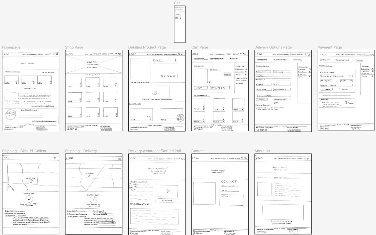
Armed with insights from user research and ideation, we transitioned to the prototyping phase. Wireframes were created to visualize the website's structure, and a high-fidelity prototype was developed to simulate the user journey and interactions.
Test
Usability testing was conducted to gather feedback on the prototype. Iterations were made based on user input, ensuring that the final design effectively addressed the concerns of our targeted users.
User Research
Our user research journey involved a total of seven interviews with ceramic lovers. These interviews provided valuable insights into their concerns, preferences, and expectations when it came to purchasing fragile products online. The affinity diagram served as a visual representation of these insights, guiding us towards the formulation of an actionable problem statement:
Ceramic lovers need to find a way to gain confidence in the delivery process because they are wary of ordering fragile items online.
How Might We:
How might we efficiently address concerns revolving around delivering fragile ceramic products intact?
How might we add a note on the website to ease potential client’s minds when it comes to ensuring that they will receive their purchase or will have help in the event that an issue does arise?
How might we better inform people on the quality of ceramic pieces packaging?
User Persona
Meet Fleur Lagrande - Ceramics Enthusiast
Sytle Tile
Wireframes & Prototypes
With a clear understanding of user needs and challenges, we transitioned to the ideation phase. The Crazy 8s activity spurred creative brainstorming, resulting in a multitude of potential solutions. These ideas were distilled into wireframes, providing a skeletal structure for the website. The wireframes served as a blueprint, defining the layout and functionality of each page.
The wireframes seamlessly evolved into a high-fidelity prototype, offering a tangible representation of the user experience. The prototype not only showcased the visual design but also simulated user interactions, allowing us to test the flow of the website. Usability testing played a crucial role in refining the prototype based on user feedback, ensuring a user-friendly and efficient final design.
Lessons in Retrospect
Reflecting on the design process, we recognized the significance of iterative testing. User feedback, gathered through interviews and usability testing, played a pivotal role in refining our design at each stage. Additionally, the use of the Crazy 8s activity proved to be a valuable tool for generating diverse and innovative solutions within a short timeframe.
Important to note, a functional device is imperative! And working on lo-fi mockups shouldn’t take 2 days…
What's Next?
As we conclude this case study, the journey doesn't end. Continuous improvement and adaptation are integral to the world of UX/UI design. Future iterations may involve additional user testing, incorporating emerging design trends, and staying attuned to evolving user preferences. The iterative nature of design ensures that the product remains dynamic and responsive to user needs.
Overview of the Mobile Responsive Site
Credits
This collaborative effort wouldn't have been possible without the dedication and creativity of the entire UX/UI design team. Special thanks to Pauline Knittel Céramique for entrusting us with this project and providing valuable insights throughout the design process. To my amazing teammates, Sylvain and Marie, thanks for making the experience so memorable. The success of the project is a testament to the collaborative spirit and commitment to user-centric design principles.


